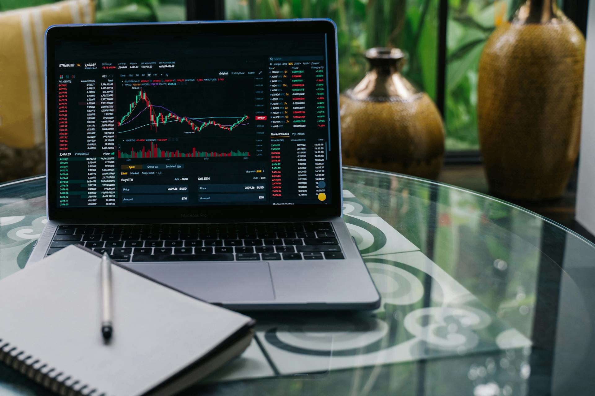
Reading currency trading charts can seem daunting at first, but it's actually quite straightforward once you know what to look for. A currency trading chart is a visual representation of the price movement of a currency pair over time.
The first thing to understand is that currency trading charts are typically displayed in a time frame, such as 1-minute, 5-minute, or 1-hour. This helps traders identify trends and patterns in the market.
A common type of chart used in currency trading is the candlestick chart, which shows the open, high, low, and close prices for a given time period. This type of chart is useful for identifying trends and reversals in the market.
To read a currency trading chart, start by looking at the overall trend of the price movement. Is the price moving up or down? Are there any significant support or resistance levels that could impact the price?
See what others are reading: Currency Market Trading Time in India
Understanding Currency Trading Charts
Forex charts provide a comprehensive visual history of a currency pair's price movements over time, aggregating and reflecting every buy and sell transaction occurring in the market.
They blend the trading activity and shifting expectations of all participants, from hedge fund algorithms to individual forex traders, condensing complex market data into an accessible pictorial format.
Forex charts allow traders to identify historical price trends, patterns, support/resistance levels, and trading opportunities, assuming that past market price behaviors and technical indicators may provide clues to future movements.
Many forex traders use charts to gain perspective on where a currency pair has been and where it may be heading.
Forex charts update with each new tick of market activity, providing a window into the fluctuations between buyer and seller forces as they occur.
Developing the skills to properly read Forex charts provides perspective on where opportunities may arise, allowing traders to craft educated, strategic trading plans grounded in the aggregated wisdom of the entire market.
Forex charts can be viewed on various time frames, including shorter time frames like 5-minutes, which reveal short-term, intraday price action, and longer time frames like daily or weekly charts, which highlight major trends.
Here's a breakdown of common time frames used in Forex trading:
- 5-minute charts: Short-term, intraday price action
- 60-minute charts: Short-term trends and oscillations
- 4-hour charts: Medium-term trends and patterns
- Daily charts: Major trends and long-term directional moves
- Weekly charts: Long-term trends and major market shifts
- Monthly charts: Very long-term trends and overall market direction
Intraday traders favor short time frames under 60 minutes to capitalize on minor price oscillations and volatility, while swing traders studying trends may use 4-hour or daily charts, and position traders focused on long-term directional moves may even look at weekly or monthly charts.
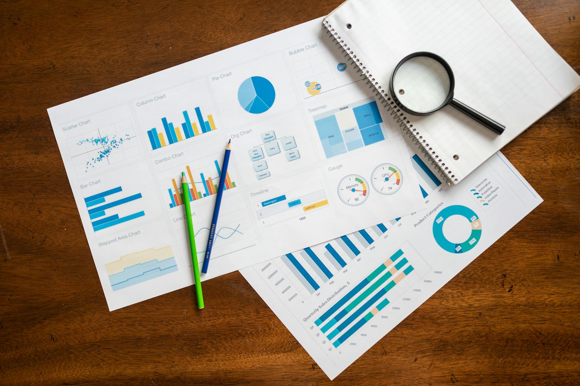
Chart Types
There are several types of Forex price charts that traders use to conduct technical analysis. The three main types are line charts, bar charts, and candlestick charts.
Each chart type offers a unique visualization of a currency pair's price action. The type of chart you choose to use will come down to personal preference, though candlestick and HLOC charts are the most popular as they display much more information than line and mountain charts.
Take a look at this: Types of Us Money
Line charts show the closing price of a currency pair over time, while bar charts display the high, low, and closing prices. Candlestick charts, on the other hand, provide a more detailed view of the market's dynamics, including the open, high, low, and closing prices.
You can also explore alternate Forex charts like mountain charts, which show price ranges over time in a layered, "mountain" style formation. Tick charts display price action based on transactions rather than time intervals.
Here are some of the main types of Forex charts:
There are 17 graph types to choose from, including time-related construction charts and time-isolated construction charts.
Patterns and Indicators
Forex indicators help us interpret forex charts and identify trends, confirming conditions like trend strength and support/resistance strength.
Technical indicators are equations or algorithms that smooth out price data, helping to eliminate price movement noise and discover inner patterns and harmony in the market. The goal is to attempt to eliminate price movement noise and discover inner patterns and harmony in the market.
A unique perspective: Currency Strength
Common technical indicator types include overlays like moving averages and oscillators like RSI, MACD, and Stochastic. These indicators quantify momentum and overbought/oversold conditions, helping to identify trading opportunities through crossovers, divergences, and overextensions.
Here are some common candlestick patterns:
- Doji signals indecision
- Spinning tops represent volatility
- Hammers indicate potential reversals
- Engulfing or tweezer patterns show shifts in momentum
You can add up to 70 technical indicators to your graph, including Linear Regression, CCI, and ADX, to help you decipher the nature of existing market trends.
Line
Line charts are a simple yet effective way to visualize price trends. They connect closing prices with a line, smoothing out intraday price movements to focus solely on end-of-period levels.
A rising line indicates an uptrend, while a falling line signals a downtrend. This makes line charts excel at visualizing prevailing trends across various timeframes.
Line charts are useful for identifying long-term trends, as they don't show intraday price range and wick data. This makes them ideal for assessing the big picture, like the growth of AUD compared to the USD.
Curious to learn more? Check out: Who Makes Us Currency Paper
Traders can use line charts to see the slope and overall direction of the trend. This helps them identify the general price trends of a currency pair over time.
Here are some key features of line charts:
- Rising lines indicate an uptrend
- Falling lines signal a downtrend
- Line charts are useful for identifying long-term trends
- They don't show intraday price range and wick data
Some traders prefer line charts because they consider the close price the most important for analyzing bullish or bearish sentiment and trends.
Point and Figure
Point and Figure charts are similar to tick charts in that they don't have a fixed interval on the x-axis and illustrate the number of transactions.
They only show movement after a certain number of transactions, and the X and O marks are filled in a rising or falling column.
The X and O marks are reminiscent of a friendly game of Tic-Tac-Toe, representing changes in price.
Each box on the chart indicates a specific price, and marks are only made when the price rises or falls enough to justify it.
Related reading: Check My Money Serial Number
A reversal on a Point and Figure chart is triggered by a change of at least three boxes, and the price must change that much before switching from X to O or vice versa.
This means there must be a clear and pronounced change in price before it's marked on the chart, giving you a broad overview of a currency pair's movement.
Identifying Trading Patterns
A hammer is a bullish pattern that indicates a potential reversal, with sellers pushing the price to a low before buyers push it back up.
Some common candlestick patterns include dojis, which signal indecision, and spinning tops, which represent volatility. These patterns can be used to identify potential trading opportunities.
The bullish harami has a large red candle body followed by a small green candle body, indicating a bearish trend may be coming to an end. This pattern is the opposite of its bearish counterpart.
A doji is a rare phenomenon where the opening and closing prices are nearly equal, indicating neither buyers nor sellers were able to affect the price. This pattern can occur during an uptrend or downtrend and may indicate a reversal.
The bearish Harami has a large green candle body with small lower and upper wicks followed by a smaller red candle body, suggesting buyers are indecisive and there may soon be a reversal to the downside.
Candlestick patterns can be combined with other technical analysis tools to confirm trade signals, such as volume and momentum indicators. For example, a candlestick signal occurring at a key support/resistance area carries more weight.
Here are some common candlestick patterns and their meanings:
Engulfing or tweezer patterns show shifts in momentum, and can be used to identify potential trading opportunities.
Relative Strength Index (RSI)
The Relative Strength Index (RSI) is a technical indicator that helps identify overbought and underbought positions in the market. It ranges from 0 to 100, with 0 being the most underbought and 100 being the most overbought.
Most currencies will fall somewhere in between on the RSI, but 70 and above is generally considered overbought, while 30 and below is underbought. Traders should consider selling positions over 70 and buying those under 30.
The RSI is similar to other indicators like Bollinger Bands, which also help determine overbought and oversold conditions. However, the RSI is specifically designed to compare currencies and provide a clear indication of market trends.
Here's a quick summary of the RSI levels:
Keep in mind that the RSI is just one tool among many, and traders should use it in combination with other indicators and analysis to make informed decisions.
Fibonacci Levels
Fibonacci levels are a powerful tool for traders to identify potential support and resistance zones. They are based on the Fibonacci sequence, a series of numbers with unique ratios and mathematical properties.
Leonardo Pisano, an Italian mathematician from the 13th century, discovered the Fibonacci sequence and its presence in nature and the universe. This sequence has been found to influence prices in the financial market.
A Fibonacci grid is constructed by connecting a high point to a low point on a chart, producing Fibonacci retracement levels. Several ratios are depicted by the horizontal lines of the grid.
The key Fibonacci ratios are 23.6%, 38.2%, 50%, and 61.8%. These ratios are commonly referred to as Fib levels.
A trader can use Fib levels to identify possible support/resistance levels and potential price reversal points.
A unique perspective: Fibonacci Currency Trading
Technical Analysis
Technical analysis is a crucial tool for traders to forecast FX prices and identify trade signals. It involves studying historical chart patterns and formations to predict the future direction of a market's price.
To get started with technical analysis, you need to learn how to read forex charts, which provides a foundation for identifying trends and patterns. This includes understanding the basic geometry of trends and support/resistance, as well as how to use technical indicators to diagnose the strengths and weaknesses in price action.
There are over 70 technical indicators that you can add to your graph, including Linear Regression, CCI, ADX, and many more. However, most of these indicators aren't particularly useful to your actual trading.
Technical indicators can help confirm conditions such as the strength of the trend, support/resistance strength, signs of weakening in a trend or in support/resistance, and volatility. The goal of using technical indicators is to attempt to eliminate price movement noise and discover inner patterns and harmony in the market.
Related reading: Currency Trading Technical Analysis
Here are some key technical indicators that can help you decipher the nature of existing market trends:
- The strength of the trend
- Support/resistance strength
- Signs of weakening in a trend or in support/resistance
- Volatility
While technical analysis can't predict the future with certainty, it helps traders gauge the likelihood of various outcomes based on how the market has behaved historically when similar formations appeared. This involves calculating the odds rather than foreseeing the unforeseeable.
For example, certain candlestick formations like the "morning star" often indicate potential trend reversals. Chart pattern analysis also looks at phenomena like price channels, flags, head and shoulders, and more.
A different take: Currency Market Analysis
See the Trend
The trend is your friend, and being able to identify it is crucial for success in currency trading.
Trends are projections linking past behavior to the future, and knowing how to read forex charts is essential for detecting and mapping them out.
A trend can be identified by looking at price action within trend lines, as seen in figure 2.
A downtrend provides excellent sell conditions, while an uptrend offers buying opportunities.
To spot trends, you need to know how to read forex charts and detect potential changes in the trend.
Renko charts are particularly useful for spotting micro-changes in trends, as they filter out minor insignificant price movements and make it easier to spot the predominant price trend.
Each brick in a Renko chart forms when the price moves and closes at a predefined setting, and the bricks move in 45-degree lines up or down based on price changes.
Related reading: Spot Currency Trading
Support and Resistance
Support and resistance are fundamental concepts in currency trading charts. They are the points where a currency pair's price stops falling or rising.
Support is where the currency pair's price stops falling, and resistance is where the currency pair's price stops rising.
The most recent resistance line for the EURUSD, shown in Figure 1, is a good example of resistance in action.
To identify support and resistance, look for areas where the price has bounced back or stalled. These zones are not exact lines, but rather areas of high and low prices.
The strength of support and resistance can be determined by chart timeframes. If a support or resistance zone is maintained throughout longer time frames, such as weekly or monthly, it's considered strong.
Here are the definitions of support and resistance:
- Support: where the currency pair's price stops falling
- Resistance: where the currency pair's price stops rising
Time Frames
Forex charts work much like other charts, with a price on the Y-axis and time on the X-axis.
You'll see markings on both axes to show the time and price for that specific chart. This visual representation helps traders identify trends and make informed decisions.
To find the best timeframe for your trading style, consider how much time you have available for active trading, how long you want your money to remain exposed to the market, and your personality.
You can trade long-term, short-term, or intraday timeframes based on your answers to these questions. Long-term traders hold positions for weeks, months, or even years and look at monthly, weekly, or daily charts.

Short-term traders, on the other hand, hold positions for several hours to a week and use hourly charts. Intraday traders use minute charts like 30-minute, 15-minute, or even 1-minute charts.
Longer timeframes give more reliable signals than shorter timeframes, but with a shorter time frame, there's a marked increase in noise and false moves.
Here's a quick rundown of the different timeframes:
Each time frame has its merits and demerits, but smart traders monitor their trades across multiple timeframes to confirm their hypothesis about the prevailing trend.
By using trends across different timeframes, a prudent trader can seek out which trend opportunities provide the highest chances of success.
Trading Tools
Trading tools are essential for analyzing and interpreting currency trading charts. They help you identify trends, patterns, and potential trading opportunities.
A Moving Average (MA) is a popular trading tool that calculates the average price of a currency pair over a specified period. It can help smooth out price fluctuations and reveal underlying trends.
A Relative Strength Index (RSI) measures the magnitude of recent price changes to determine overbought or oversold conditions. An RSI reading above 70 often indicates an overbought market, while a reading below 30 may suggest an oversold market.
Best Brokers
Choosing the right broker is crucial when it comes to trading. Here are some key factors to consider: platform features, educational resources, chart types, and account types.
Platform features can make or break your trading experience. You'll want a broker that offers a user-friendly platform with all the tools you need to succeed.
Educational resources are also essential for learning how to read forex charts. Look for brokers that offer comprehensive guides, webinars, and video tutorials.
Chart types are another important consideration. Make sure your broker offers a variety of chart types, including line charts, bar charts, and candlestick charts.
Account types can also impact your trading experience. Consider a broker that offers a range of account types, including demo accounts, live accounts, and Islamic accounts.
Here are some of the best brokers for learning how to read forex charts:
Remember, it's essential to do your own research and compare options before choosing a broker.
Features and Benefits
As a trader, you're looking for tools that can give you an edge in the market. FXStreet's Interactive chart is a must-use tool that offers a very professional platform.
It's fully customizable, so you can tailor it to your needs. Plus, it's web-based, which means you don't need to install anything.
The chart is updated in real-time, giving you tick-by-tick data. And the best part? It's totally free, with no hidden costs or fees.
You'll have access to over 6000 assets, including all Forex pairs, Cryptocurrencies, Commodities, Indices, and US stocks. This is a vast library of data, and you'll be able to find the information you need quickly.
The chart also provides unique interbank rates, which can be a valuable resource for traders. And if you need to look back at historical data, you'll find extensive records available.
One feature that's worth mentioning is the option to save your configuration. This means you can set up your chart exactly how you like it and save it for future use.
Here are some of the key features and benefits of FXStreet's Interactive chart:
- fully customizable
- web-based (no installation needed)
- updated in real time (tick-by-tick)
- totally free of charge
- over 6000 assets available
- unique interbank rates
- extensive historic data
- option to save your configuration
How to Read

Reading a currency trading chart is like understanding a story of two currencies. The chart shows the exchange rate between two currencies, as simple as that. This is the foundation of forex trading.
The chart shows the open, high, low, and close prices of a currency pair. These are the prices at the start, highest, lowest, and end of a period. Knowing these prices helps you know when to buy low and sell high.
The chart has two essential components: the price/time axis and exchange rate pricing in pips. The horizontal x-axis shows the time periods, while the vertical y-axis displays the exchange rate price.
An uptrend is visible when exchange rates rise from left to right across the chart, indicating buying momentum in the market. Downtrends feature falling exchange rates over time as selling pressure pushes prices lower.
Each chart shows the exchange rate of a currency pair. For example, the EUR/USD chart shows exactly how many dollars you could buy with one Euro. The wiggly line on the chart tells you how much 1 EUR costs in USD over a selected period.
Take a look at this: Taux De Change 100 Franc Suisse / Dollar
The chart tells you when it is time to buy and when it's time to sell. If the line goes up, that means that a Euro will cost more USD to buy, and if it goes down, that means EUR is cheaper compared to the US dollar.
To read a forex chart, you need to understand the relationship between two currencies. The chart will show you the open, high, low, and close prices of a currency pair, which are important for making trading decisions.
Here are the key prices to know:
- Open: the price at the start of a period.
- High: the highest price traded during a period.
- Low: the lowest price traded during a period.
- Close: the price at the end of a period.
Featured Images: pexels.com