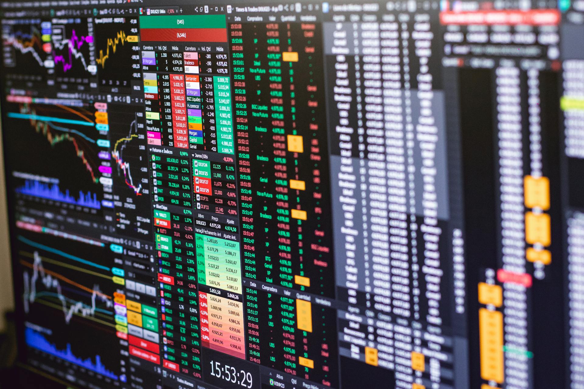
Thinkorswim charts can be overwhelming at first, but with some customization and practice, you can unlock their full potential.
Thinkorswim offers a wide range of chart types, including line charts, candlestick charts, and bar charts, each with its own unique benefits.
One of the most useful features of thinkorswim charts is the ability to add multiple indicators, such as moving averages and RSI, to help you identify trends and patterns in the market.
By customizing your charts, you can create a visual representation of the market that makes sense to you and helps you make informed trading decisions.
See what others are reading: Tradestation Charting
Customizing Charts
Customizing Charts is a breeze with ThinkOrSwim. You can create a custom chart via simple tools found on the interface of ThinkOrSwim chart settings.
To start, you'll need to determine the symbol to display the price plot on. Simply type in the symbol name you need in the Symbol Selector box. You can also add a study to be displayed on an individual subgraph, which will add a new subgraph below the volume.
The additional controls below the lowest subgraph are also worth exploring. The cursor type, for instance, brings up the menu for customizing the cursor shape. This can be a game-changer for traders who need to make precise selections on the chart.
Intriguing read: How to Add Indicators on Thinkorswim
Overlay

Overlay charts are a powerful tool to compare the performance of different stocks or indexes on the same chart.
To create an overlay stock chart, start by bringing up a chart from the Charts tab and selecting Studies from the upper right.
From the expanded menu, hover over Add study and then select Compare with at the bottom of that menu.
This will allow you to choose a default index symbol, such as DJX or SPX, or enter a custom symbol to overlay it on the chart.
The left vertical axis is automatically scaled for the overlay symbol, so the high and low range fits on the same chart.
You can add more index or custom symbols to the chart as needed.
To customize the display of the overlay chart, open Chart settings by clicking the gear icon.
Here, you can switch the right vertical axis to show percentage changes by checking Show price as percentage under the Price axis tab.
A different take: Gold Percentage Chart
Using Drawings
Using drawings on your charts is a powerful tool to help you visualize market trends and make informed investment decisions. You can overlay multiple stock charts to compare the financial sector and the S&P 500 index.
An overlay stock chart allows you to measure relative strength and correlations between stocks, sectors, or asset classes. This can be a game-changer for traders who want to identify opportunities and potential risks.
You can also set alerts according to trendlines, retracement levels, price channels, and more. This way, you'll know about important price movements right away and can adjust your strategy accordingly.
Drawing alerts can be triggered whenever a security price breaks through a trend, giving you timely notifications to stay ahead of the market.
Backtesting is another useful feature that lets you test strategies according to indicators and get hypothetical profit and loss results. This helps you refine your approach and make data-driven decisions.
Suggestion: Pypl Stock Chart
The ThinkOrSwim app also allows you to plot future dates to the right of the current date, making it easy to track upcoming earnings and dividend dates. This feature is especially useful for investors who want to stay on top of company announcements and events.
You can extend drawings, such as trendlines, into the future to set probable price targets. This helps you anticipate potential price movements and adjust your strategy accordingly.
The Probability Cone is another useful drawing feature that encloses a predefined extent of probability according to your preference. This feature is particularly useful for paper trading and helps you visualize potential price ranges.
Here are some key drawing features to keep in mind:
- Overlay Stock Charts: Compare multiple stocks or indexes on a single price chart.
- Drawing Alerts: Set alerts according to trendlines, retracement levels, and more.
- Backtesting: Test strategies according to indicators and get hypothetical profit and loss results.
- Future Corporate Actions: Plot future dates to track upcoming earnings and dividend dates.
- Probability Cone: Visualize potential price ranges according to your preference.
Patterns
Patterns are a crucial part of chart analysis. They help investors identify market trends to make informed decisions.
Candlestick patterns are a type of pattern found in ThinkOrSwim charts, which use green candles to indicate bullish trends and red candles to indicate bearish trends.

Classical patterns are larger and take a couple of weeks to complete, making them a more long-term indicator.
Fibonacci patterns are based on the Fibonacci sequence, a series of numbers where each number is the sum of the two preceding numbers.
You can use these patterns to gain insights into market trends and make more informed investment decisions.
For your interest: Fibonacci Retracement in Thinkorswim
Customization
Customization is a key feature of ThinkOrSwim charts. You can create a custom ThinkOrSwim chart via simple tools on the interface of ThinkOrSwim chart settings.
To start, you'll need to determine the symbol to display the price plot on. You can type in the symbol name you need in the Symbol Selector box. Below the option tabs, you'll find additional subgraphs icons. By default, the only visible subgraph is volume, which displays the volume histogram and volume-based studies.
You can add a study to be displayed on an individual subgraph, which will add a new subgraph below the volume. Some other controls you'll find below the lowest subgraph include the cursor type, right expansion, and scrollbar.
Intriguing read: Thinkorswim Add Volume to Chart

The cursor type lets you customize the cursor shape, while the right expansion brings up a menu to select the desired chart's expansion area. The scrollbar allows you to scroll the time axis, and a single click on either arrow will let you scroll your chart to the left or the right.
Here are some common controls you'll find below the lowest subgraph:
- Cursor type: Customizes the cursor shape
- Right expansion: Selects the desired chart's expansion area
- Scrollbar: Scrolls the time axis
By experimenting with these tools, you can create a custom chart that suits your needs and helps you make informed investment decisions.
Probability Cone
The Probability Cone is a powerful tool that can help you visualize potential price movements in the markets.
This study is built specifically for future dates and gives you a probable price range at different contract expirations.
You can add the Probability Cone to your chart by selecting Studies > Edit studies icon and selecting ProbabilityOfExpiringCone.
Double-click to add it to the list of chart studies under Added studies and strategies, and then click the gear symbol to the right of ProbabilityOfExpiringCone to adjust the parameters.
For your interest: Best Thinkorswim Studies

The "period" is the number of future dates for which the probability cone is calculated, and the "prob range" is the probability the projected range covers.
The default "prob range" is 68%, which corresponds roughly to one standard deviation.
Set it to 95% to see a cone that covers two standard deviations or 99% to cover three standard deviations.
Probability analysis results are theoretical in nature, not guaranteed, and do not reflect any degree of certainty of an event occurring.
By adjusting these parameters, you can get a better understanding of the potential price movements in the markets.
Broaden your view: Thinkorswim Not Working
Aggregation Periods
Customizing charts is all about finding the right balance between detail and practicality. ThinkOrSwim charts offer a range of aggregation periods to help you achieve this.
You can change the aggregated period to suit your needs, from 5-minute to 1-day, or even per week. This allows you to focus on specific time frames that make sense for your analysis.
One of the most useful aggregation periods is the 30-minute period. This is because it provides a good balance between detail and practicality, making it ideal for analyzing long-term market conditions.
If you're looking to analyze data for a short period, such as one month, using a 30-minute aggregate period is a great option. It allows you to squeeze a month's worth of data into a more manageable timeframe.
Here are the available aggregation periods in ThinkOrSwim charts:
- 5-minute aggregation period
- 15-minute aggregation period
- 30-minute aggregation period
- 1-hour aggregation period
- 1-day aggregation period
- per week aggregation period
Alerts and Notifications
Alerts can be set based on chart drawings such as trendlines, retracement levels, and price channels.
To set an alert, select a drawing line on the chart and right-click to select Create alert in the drop-down menu, then choose Single or Calendar. A dialog box will open up that allows you to define how the alert should trigger.
Drawings are essentially simple lines, so alerts can trigger when prices cross them. You can also set standard alert preferences from this menu, such as the notification method or when the alert should expire.
Check this out: Thinkorswim Alert Settings

A flag will appear on the chart drawing to indicate that an alert was set, and you can edit or cancel the alert by right-clicking the flag. You can also add the drawing alert to the Alert Book section of the MarketWatch tab.
The Alert Book displays the name of the drawing and symbol for each alert, as well as the time frame of the applicable chart. Understanding the chart's time frame is important, as the slopes of lines change when they're applied to different chart aggregations.
If an alert was created on a specific chart aggregation, it will only trigger when a crossover occurs on the same aggregation. This means that a crossover on a 15-minute chart may not appear on a five-minute chart, and the alert won't trigger.
Readers also liked: Thinkorswim Moving Average Crossover Script
Backtesting and Analysis
Backtesting is a valuable tool for reviewing trading strategies and seeing how they might have performed in the past. This approach is especially useful for evaluating technical indicators.
Backtesting displays hypothetical profit and loss (P&L) performance on a chart, giving traders a clear visual representation of potential outcomes. This information can be used to evaluate potential trade entry and exit points.
By using backtesting, traders can get a better sense of how a specific strategy might perform, and make more informed decisions about their trades.
For another approach, see: Thinkorswim Backtesting
Backtesting
Backtesting is a way to review trading strategies by applying them to historical data.
This approach helps traders see how strategies based on technical indicators might have performed in the past.
Backtesting displays hypothetical profit and loss (P&L) performance on a chart, giving traders a visual representation of potential outcomes.
It gives traders an idea of how a specific strategy might perform, and how they can use that information to evaluate potential trade entry and exit points.
By using backtesting, traders can assess the effectiveness of their strategies and make informed decisions about future trades.
Readers also liked: Free Forex Backtesting Software
Adding Future Dates
You can extend a trendline or other drawing into empty space by hovering directly over it and right-clicking. This allows you to plan for future dates.
A user can select Extend to the right from the menu to extend the line to those future dates.
Data Management
Data Management is a crucial aspect of using thinkorswim charts. You can store up to 10 years of historical data for each symbol, which is a huge advantage for long-term analysis.
Thinkorswim offers various tools for data management, including the ability to download historical data and import it into other platforms. This feature is especially useful for users who need to access their data outside of the thinkorswim platform.
You can also use thinkorswim's data management tools to set alerts for specific market conditions, such as when a stock reaches a certain price or when a trend line is broken. This feature helps you stay on top of market movements and make informed trading decisions.
Thinkorswim's data management capabilities also include the ability to save and reuse custom charts. This feature allows you to create complex charts with multiple indicators and save them for future use, which can save you a lot of time and effort.
Getting Started and Modes
You can customize the default settings for ThinkOrSwim charts by switching between chart modes.
ThinkOrSwim offers a variety of chart modes, including bar charts, line charts, and others.
By default, you get the candle chart type, but you can change it to suit your needs.
You can choose from several chart modes, including Monkey Bars, Seasonality, and Monkey Bars Expanded.
Here are some of the chart modes available in ThinkOrSwim:
- Monkey Bars: These charts display price action over the timeframe under study.
- Seasonality: This chart mode shows the number of months per year (or multiple years) when a stock rose or fell, via bars in a histogram.
- Monkey Bars Expanded: This mode is a further expansion of the Monkey Bars.
- Standard: This umbrella includes bar charts, area charts, candle charts, line charts, candle trend charts, and so on.
The Standard chart mode is an umbrella term that includes several types of charts, including bar charts and line charts.
Frequently Asked Questions
Does Thinkorswim have charts?
Yes, Thinkorswim offers charts for various symbol types, including stocks, options, futures, and forex. View and analyze price plots to make informed trading decisions.
Can I use Thinkorswim for free?
Yes, Thinkorswim is a free trading platform, but you'll need to fund your account to start trading. You can also use their simulated trading account with real-time data for a small deposit.
Is Thinkorswim or TradingView better?
Thinkorswim is ideal for serious stock analysis and a focused trading environment, while TradingView is better suited for chart-driven traders and community inspiration. Ultimately, the best choice depends on your individual trading needs and preferences.
How do I customize my thinkorswim layout?
To customize your thinkorswim layout, select the customization options and apply your changes by clicking "Apply Settings" at the lower right corner of the screen. This will help you tailor your workspace to suit your trading needs.
How to save chart settings in thinkorswim?
To save chart settings in thinkorswim, click "Setup" in the top right corner of the main window and select "Save Workspace as...". This will preserve your chart settings for later use.
Sources
- https://www.schwab.com/learn/story/5-thinkorswim-charting-tools-tips
- https://my.simplertrading.com/trading-education/tutorials/how-to-show-earnings-in-thinkorswim
- https://globaltradingsoftware.com/trading-knowledge-thinkorswim-charts/
- https://www.schwab.com/learn/story/getting-started-with-thinkorswim-charts
- https://usethinkscript.com/threads/agaig-best-trading-chart-setup-for-thinkorswim.18436/
Featured Images: pexels.com