The Canadian currency tactile feature is a vital aspect of accessibility, especially for individuals with visual impairments. The tactile feature on Canadian banknotes is a raised dot pattern, which helps users identify the denomination.
This feature is achieved through a unique combination of raised dots, arranged in a specific pattern, on each banknote. The pattern is designed to be easily distinguishable by touch, allowing users to identify the denomination without relying on sight.
For example, the $100 banknote has a unique dot pattern that is distinct from other denominations. This pattern is made up of a series of raised dots, arranged in a specific sequence, that can be felt by touch.
The tactile feature is just one of the many accessibility features built into Canadian currency, making it easier for everyone to use and manage their finances.
See what others are reading: Nvidia's Stock Surge Has Raised Concerns among Traders
Canadian Currency Tactile Feature
The Canadian currency tactile feature is a great way for Canadians who are blind or partially sighted to recognize their bank notes with confidence. This feature consists of symbols of six raised dots, known as the tactile feature.
The number and position of these six-dot symbols vary according to the denomination. For example, the $5 note has one six-dot symbol, while the $10 note has two, and the $20 note has three.
Here's a breakdown of the tactile feature for each denomination:
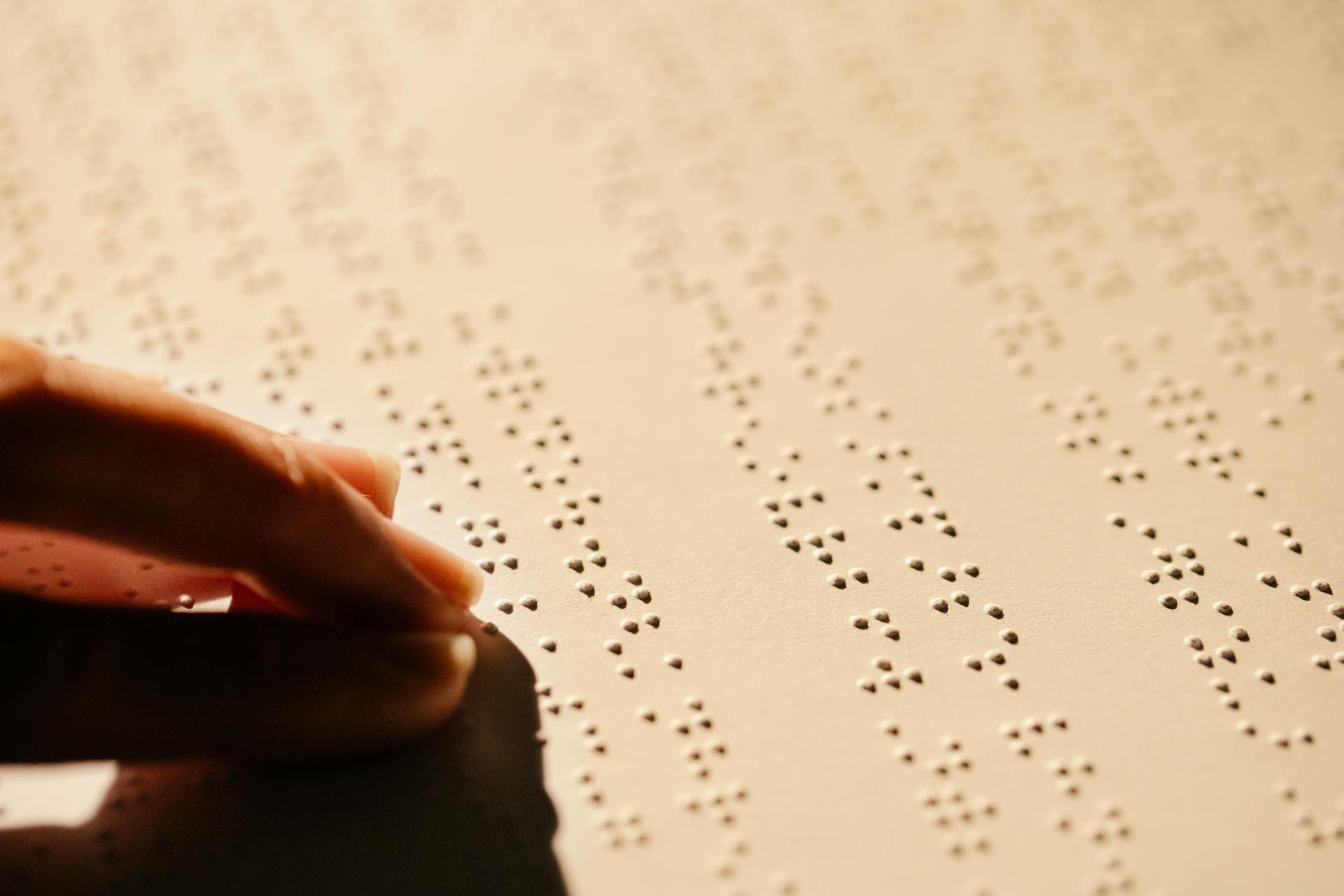
This system was developed in consultation with Canadians who are blind or partially sighted, and it's not Braille.
Accessibility Features
Canada's bank notes have several accessibility features to help people who are blind or partially sighted recognize the denominations with confidence.
The distinct colours used for each denomination assist individuals who are partially sighted to recognize their bank notes. The colours used for each denomination are consistent with those used for previous series.
Here's a breakdown of the colours used for each denomination:
The tactile feature on Canadian bank notes consists of symbols of six raised dots, separated by a smooth surface. The number and position of these six-dot symbols vary according to the denomination.
Here's a breakdown of the tactile feature for each denomination:
- $5: one six-dot symbol
- $10: two six-dot symbols
- $20: three six-dot symbols
- $50: four six-dot symbols
- $100: two symbols separated by a smooth surface that is wider than that on the $10 note
The tactile feature is not Braille, but was developed in consultation with Canadians who are blind or partially sighted.
Canadian Journey $10 Note Upgrade
The Canadian Journey series has seen some exciting upgrades over the years. One notable example is the upgraded $10 note, which features a new design and signatures.
The upgraded $10 note was issued on 18 May 2005, and it measures 152.4 x 69.85 mm (6.0 x 2.75 inches) in size. This note has a new theme, Remembrance and Peacekeeping, which is reflected in its design.
The front of the note features a portrait of Sir John A. Macdonald, the Prime Minister from 1867-1873 and 1878-1891. The signatures on the note are W.P. Jenkins on the left and D.A. Dodge/M.J. Carney on the right.
Broaden your view: Canadian Bank Note Company
Canadian Currency Design
The Canadian currency design has undergone significant changes over the years. The current design features a predominantly green and purple color scheme.
The Canadian $100 bill, for example, features a portrait of Sir Wilfrid Laurier, a former Prime Minister of Canada, on one side. The other side features a depiction of the Canadian landscape.
The Canadian $50 bill features a portrait of William Lyon Mackenzie King, another former Prime Minister of Canada. The bill also features a Canadian landscape on the other side.
The tactile feature on Canadian currency is designed to help visually impaired individuals identify the denomination of the bill. The feature is a series of raised dots on the large polymer bills.
The raised dots on the large polymer bills are located at the bottom right corner of the bill.
If this caught your attention, see: How Much Are Canadian Two Dollar Bills Worth
Frequently Asked Questions
What are the security features of Canadian currency?
Canadian currency features several security measures, including a metallic stripe, ghost image, dashes, puzzle number, raised ink, UV feature, and maple leaves, which can be detected through various methods such as tilting and holding the note up to the light. These features help prevent counterfeiting and ensure the authenticity of Canadian banknotes.
Sources
- https://www.pngegg.com/en/png-oennd
- https://pubmed.ncbi.nlm.nih.gov/12502159/
- https://www.bankofcanada.ca/banknotes/audience-specific-resources/blind-and-partially-sighted/
- https://www.bankofcanada.ca/banknotes/bank-note-series/canadian-journey/
- https://diverseabilities.ca/entries/braille/identifying-currency
Featured Images: pexels.com